Chat is the wrong convention to make great AI products
In most cases, chat is not the best interface for AI experiences.

After my second Moonfire Pulse, I can’t stop thinking about how AI interfaces need to escape chat to become great products. And I have a hunch where the answer lies…
At last year’s event, as Beyond Work was just getting started, my thoughts were dominated by what happens if Vision Pro replaced hardware interfaces, and ChatGPT disrupted software. Why are you going to click around with a keyboard and mouse on icons (most of which you don’t ever use) when the computer now speaks your language?
After a year exploring this question within an AI startup, it seems clear that having to exhaustively write out what you want a computer to do is still the equivalent of writing code, not using a product.
In traditional software, we solved this through useful symbols that concentrate a load of code into a function, based on context. But we don’t want to go fully back there and just give the user a load of buttons — that loses the powerful upsides of this new technology, particularly its flexibility and powers of iteration.
So let’s think about this. The symbols LLMs understand right now are tokens, built up of the largest possible recurring word chunks. You write a sentence, it digests it into those chunks then generates a response from the most closely related chunks in its training data.
This works well when you have a GENERAL transformer. But once you put it into the context of a product, and a moment of user intent, we should be able to assume a lot more of these tokens, and require fewer directly from the user.
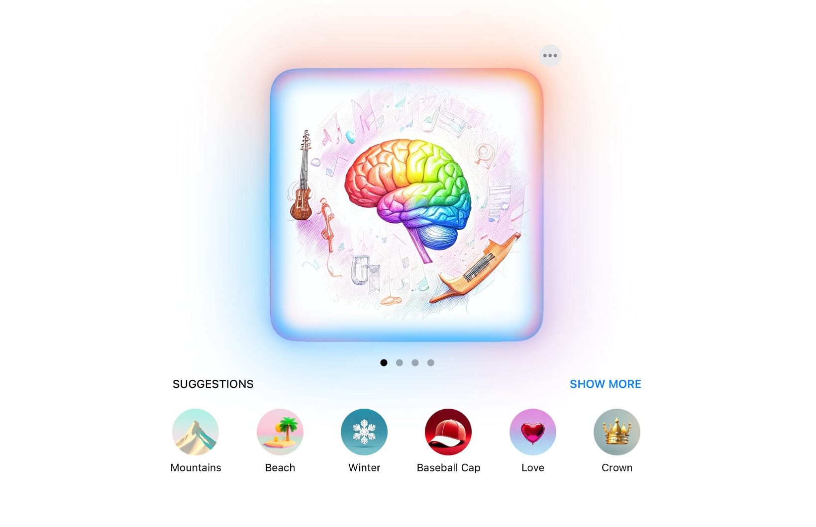
This is what Apple has done excellently in its design of Apple Intelligence. If you look at its image generation, it uses one word “chips” that you drag into the generation area. They know you are making images. They can make suggestions as to useful/fun/interesting terms and offer them to you.

On the human experience side, these become the symbolic tokens. There’s no need to write a whole long sentence - you just need to offer a few symbols.
I think this is one path through. The product creator fills the prompt with the crucial and useful context — such that the user only needs to do very little to make it clear what outcome they are hoping to motivate.
But what does this look like? For that, I take inspiration from another realm where people are offered a set of context-dependent options. Where they set intelligence in action on their behalf, and feel satisfaction when the scenario is complete.
I think AI product people need to start seriously looking at, hiring from and stealing from, the world of gaming.
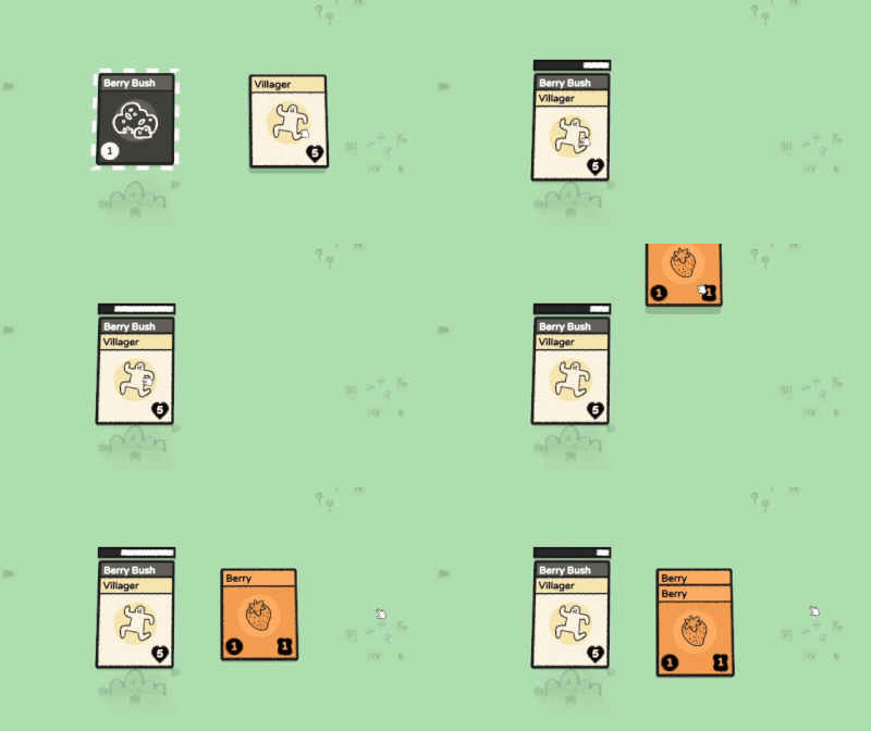
For example, card games give you a stack of options to play in a scenario, often with additive effects if you combine them. They can accommodate multiple players, and are a deeply familiar conceptual object.
They also open the door to spatial experiences. If I’m managing AI automation across my business, maybe they sit in a giant Figma board, with a team’s running AI tasks stacked together, or in zones and regions.

If I drag a file or folder onto a stack, it can become a new card. When it’s done, it can be replaced with another card to represent how it was transformed.
Maybe the individual experience is more like blackjack, with card outlines in front of the dealer and the user holding a stack of options.
Multimodal options really thrive here too — take a picture of something and then drag a card onto a visible object to transform it. Or recognise the items in the picture and drag them out into other working tasks.
There’s so much context in the world we should be able to use to make this work. In your job, we could know what your business does, what team you work in, what your job title is — and that’s even before learning from the ways you use AI over time.
Another example: I’m prototyping a cooking app where you take pictures of dishes you cook and over time it makes suggestions for you to experiment with. It’s very simple to add in all capitals to every prompt behind the scenes “NEVER SUGGEST ANYTHING THAT ISN’T A FOOD ITEM” or similar. It’s very simple to establish an array of things a user might want to do — and in some ways, the more limited and focused, the better the experience.
So here it is: software is always a symbolic exchange — but chat interfaces are more verbose than needed for most users, most of the time. Anyone designing a product with AI at its core should spend less time worrying about models and AGI, and more time thinking about how it works on the user side to be worth their time.
In some sense, nothing has changed about making good products, we're just working with a different material behind the scenes.

